Out of the shadows
Out of the shadows
The story behind the chiaroscuro revolution
By Anne Desmet RA
Published 4 March 2014
As exceptional examples go on display in ‘Renaissance Impressions’, printmaker Anne Desmet RA reveals the story behind this pivotal development and discusses why these rare prints continue to dazzle us today.
-
From the Spring 2014 issue of RA Magazine, issued quarterly to Friends of the RA.
The lives of the characters who starred at the dawn of European printmaking were as full of light and shade as their prints. Mantegna allegedly attempted to murder fellow painter Zoan Andrea and engraver Simone da Reggio. Antonio da Trento, while working for Parmigianino, stole his boss’s printing blocks and drawings and made off, never to be seen again. Other printmakers who engaged in fraud, forgery, slander, image piracy and political revolt were often imprisoned. Yet, equally, during the 16th century these artists were moving in lofty circles, their praises sung by scholars and poets.
Chiaroscuro, the Italian term for strong contrasts between light and shade, is also the technical term for the use of such contrasts to achieve a sense of volume when depicting an object – such as a human figure – on a flat plane. The rendering of light and shade – both subtle and dramatic – was a significant focus of painting, drawing and printmaking at this time, Leonardo’s Mona Lisa (c.1503-06) being the most famous example. Chiaroscuro woodcuts remain relatively little known or studied, although they represent a technical and aesthetic pinnacle in printmaking, deserving much wider recognition. The ‘Renaissance Impressions’ exhibition at the Royal Academy, comprising loans from both Vienna’s Albertina and from the holdings of the German contemporary artist Georg Baselitz Hon RA, offers a rare chance to see two outstanding collections of them together, with some works on show for the first time.
During the European Renaissance, chiaroscuro woodcuts were primarily conceived as a means of replicating the effects of chiaroscuro drawings in new, original images that could be printed in multiples and thus more widely disseminated to larger audiences, at lower prices, than equivalent one-off drawings.
Chiaroscuro drawing was a popular means of rendering dramatically lit bodies that seem to loom theatrically out of the paper surface on which they were drawn. This new technique involved working on toned instead of white paper, and drawing in a dark medium with white highlighting. The artists used black (or red) and white chalks, or black ink and white gouache, with the coloured paper providing mid-tones. In Italy in particular, this new, expressive style gradually superseded silverpoint: drawings made by dragging a silver rod or wire across a surface prepared with gesso or primer (Dürer’s silverpoint Self-Portrait as a Thirteen Year-Old, from 1484, is a well-known example). Chiaroscuro drawing was more technically forgiving than silverpoint and, with its wider range of effects, was enthusiastically adopted by artists. For the first time, drawings became desirable art objects. They were also invaluable compositional studies and widely copied teaching aids – Raphael’s drawings, among others, were highly prized by patrons and collectors.
At exactly this time, when such exemplary draughtsmanship became the measure of artistic accomplishment in Renaissance art, printmaking was being refined by artists into a sophisticated medium through which to convey diverse effects of line, tone and form. This simultaneous conjunction of technical and aesthetic factors resulted in a period of creative experimentation from the early 1500s, during which chiaroscuro woodcut techniques were devised.
David Landau and Peter Parshall, in their seminal volume The Renaissance Print 1470-1550 (1994), sensibly suggest that printmaking would have provided artists with a welcome opportunity to fill time between altarpiece commissions and other projects and, unlike painting, could be undertaken after dark, by candlelight. By 1425 printed ephemera abounded, as mass production methods for papermaking arrived in Europe, followed swiftly by Gutenberg’s inventions of the printing press and moulds to facilitate metal type manufacture. Printed material included playing cards, advertisements and small votive images of saints that were often bartered as religious indulgences or talismans to ward off plague.
-

Hendrick Goltzius, Hercules Killing Cacus, 1588.
Jacopo Berengario da Carpi, Diogenes, c.1525.
Hans Burgkmair the Elder, Lovers Surprised by Death, c. 1510.


-
By 1450 book publishing was booming, especially in Nuremberg and Venice. This created demand for increasingly refined woodcut illustrations – such as Aldus Manutius’s Venetian masterpiece, Poliphilus’s Dream About the Strife of Love (1499, not in show). This lavishly illustrated romance is a renowned example of early printing. Its typography is famous for its quality and clarity, and the volume is illustrated with 168 exquisite woodcuts showing the scenery, architectural settings and characters Poliphilus encounters in his dreams.
The text for books was initially carved and printed using single woodblocks, just like the illustrations. Later, movable type was designed to be printed with woodcut illustrations – blocks and fonts being made to the same height so that each page of text and image could be inked and printed together. Although metal engraving and etching were also developing, woodblock printing was a focus of artistic innovation because of this kinship with book printing.
By 1500, millions of printed books had been produced throughout western Europe. Meanwhile, vast printed maps and other ambitious print projects were being essayed. Single-leaf art prints were portable, commercial items that could be traded alongside paper, books, maps and other commodities at the annual Frankfurt Fair (which was in existence as early as the 13th century) and elsewhere. Thus mass communication dawned, facilitating widespread circulation of ideas, imagery and information in the European Renaissance, hastening the Reformation and exponentially expanding levels of literacy and education among the middle classes of an increasingly market-driven society. It was this heady atmosphere of entrepreneurialism and innovation that gave rise to the chiaroscuro woodcut.
Wood was an obvious printing matrix, being plentiful and available. Woods such as pear, boxwood, European maple, apple and medlar were all suitable for detailed cutting of text or imagery and were readily printable, in relief, alongside movable type. Wood was generally cut along the plank, rather than across the grain, making it possible to work on larger pieces and reducing the danger of blocks splitting. Inking was done with a dabber (a soft leather ball stuffed with rags and rolled in oil-based ink) or occasionally by brush or an early type of roller.
A chiaroscuro print typically used between two and five woodblocks, or occasionally a more technically challenging combination of metal engraving and woodcut. As Stephen Chambers RA explains, each block was cut to render a separate tonal aspect of the image. Each was printed one at a time, each in a different colour or tone, to create one complete image with carefully calibrated tonal contrasts, a sense of three-dimensional volume, the linear and cross-hatched qualities of a drawing and also, sometimes, tones and textures simulating watercolour.
‘For the first time colour was introduced into the woodcut,’ explains curator Achim Gnann from the Albertina. ‘With colour, light and lineament creating plasticity, space and atmosphere, new artistic directions opened up. The transition between a monochrome print and a coloured picture became fluent with the chiaroscuro woodcut.’
-
Ugo da Carpi, after Raphael, The Miraculous Draught of Fishes, c. 1523-27.
Chiaroscuro woodcut printed from three blocks, the tone blocks in red. 23.4 x 25.7 cm. Albertina, Vienna. Photo Albertina, Vienna.

-
While single-block, monochrome, woodcut prints were developed to astonishing levels of technical and aesthetic accomplishment by the likes of Martin Schongauer, Dürer and Albrecht Altdorfer in Germany, Lucas van Leyden in the Netherlands, and Mantegna in Italy, the advent of multiple-block chiaroscuro prints produced richly volumetric, dramatic imagery of a type hitherto unseen. Sometimes they were the work of an individual, highly versatile artistprintmaker but increasingly they were created as collaborations between an artist-designer, an expert block-cutter and a printer. Exponents included Hans Wechtlin in Germany, and Marcantonio Raimondi in collaboration with Raphael, Giulio Campagnola and Parmigianino in Italy. These and other talented contemporaries developed works with the characteristics of both painting and drawing, yet with new qualities particular to print. Their methods were carried into the later 16th century by fine artists such as Andrea Andreani and Hendrick Goltzius, whose spectacular Hercules Killing Cacus (1588, page 42) is in the show. This particular impression is regarded by Baselitz as the finest in existence.
German artist Lucas Cranach the Elder’s St George and the Dragon (c.1507, not in show) appears to be the first woodcut of the genre. It involved a line block for the image and a second block for printing gold highlights, the two blocks being printed onto blue-toned paper. This was swiftly followed in 1508 by another St George and other images by Hans Burgkmair the Elder who, working with a skilled woodcutter from Antwerp, Jost de Negker, added significant refinements to the method, replacing toned paper with a printed tone block, out of which are cut the brightest highlights in the image, which appear paper-white in the finished print. Burgkmair’s Lovers Surprised by Death (c.1510, left), a three-block woodcut, is a definitive example. It juxtaposes a sparkling Venetian setting with the heart-stopping view of Death, who thwarts a fleeing maiden by gripping her dress in his teeth while, with terrifying skeletal hands, he rips the soul from the inert body of her lover. The fully volumetric, crisply detailed modelling of figures and setting have all the impact of the 1973 horror film Don’t Look Now, which famously featured a macabre red-cloaked figure roaming the beautiful streets of Venice.
In Italy, meanwhile, Ugo da Carpi tried to claim credit, in 1516, for the ‘invention’ of what was, essentially, Burgkmair’s technique, an indication of the esteem in which the medium was held. Da Carpi produced striking chiaroscuro woodcuts in collaboration with Titian, Raphael and Parmigianino. One of his masterpieces is The Miraculous Draught of Fishes after a fairly loose sketch by Raphael. With its vivid red, almost abstract blocks of colour, its bold composition and somewhat spare drawing style, it looks every bit as modern as contemporary artist Peter Doig’s painting Figures in a Red Boat right Witches’ Sabbath, 1510, by Hans Baldung Grien below An Apostle, c.1540-45, by Domenico Beccafumi (2005-07), on view at Doig’s retrospective, last year, at the Scottish National Gallery.
Another of Da Carpi’s masterpieces is his Diogenes after a design by Parmigianino, a woodcut involving four blocks and printed in several different colour variants. Diogenes, the fourth-century Greek philosopher, cynic and eccentric, is shown here with a plucked chicken. The image recalls Plato’s definition of man as an animal, bipedal and featherless, to which Diogenes, in response, is said to have plucked a chicken and declared: ‘Here is Plato’s man.’ Diogenes apparently lived barefoot in a barrel and took the mythological Hercules as role model, believing virtue was better shown in action than in theory. Da Carpi’s image shows a semi-naked Diogenes of Herculean build and gravitas, the ellipse of his barrel visible behind him. It is an image with arresting qualities of movement, action and sculptural volume. The Albertina boasts a fine Diogenes in greens and pearly blue-greys, while one of the impressions owned by Georg Baselitz creates a different mood in hot reddish-browns.
-
Hans Baldung Grien, Witches’ Sabbath, 1510.
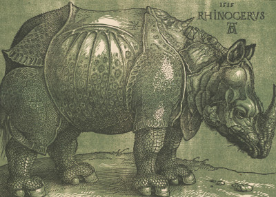
A chiaroscuro woodcut made after 1620 by printmaker Willem Janssen, after Albrecht Dürer’s Rhinoceros, 1515
Domenico Beccafumi, An Apostle, c.1540-45.


-
It is easy to see why artists continue to be drawn to these prints today – whether as admirers, imitators or, in the case of Baselitz, as serious collectors. Baselitz’s passion for them, says David Ekserdjian in the exhibition catalogue, ‘lies in their directness, in the sense that nothing comes between the viewer and their creator’. Both his collection and the Albertina’s include fine and rare examples. Baselitz’s holdings feature the only known impression of a particular work by German woodcutter Erasmus Loy, who made boldly inventive images of Italianate architecture, such as Courtyard with Renaissance Architecture (c.1550). Loy’s prints were not designed for folios but were instead pasted onto wood to be used as cheap substitutes for inlaid decoration in the home. This function explains why so few have survived, and the show also includes a fine companion piece from the Albertina.
In the German style, typically, a single ‘line block’ held the entire composition and would read perfectly well as a stand-alone print. To add drama, volume and highlights, additional ‘tone blocks’ were cut, as in Hans Baldung Grien’s Witches’ Sabbath (1510), in which a collection of aged crones are seen cavorting naked beneath a tree, concocting their hellish brews and enjoying a spot of bareback goat-riding. German line blocks were often printed in black, the tone blocks supplying colour. Dürer’s famous Rhinoceros (1515) was originally created as a single-block woodcut – Dürer, in fact, never created any chiaroscuro woodcuts. The chiaroscuro version in the exhibition was actually created by the Amsterdam publisher Willem Janssen, who added tone blocks to the original Dürer blocks that he had acquired in The Hague about a century after the artist’s death, adding a new dimension to Dürer’s original line image.
Chiaroscuro prints were produced widely in the Netherlands in the second half of the 16th century, as well as in France (for reproduction purposes) and England in the 18th century. The Italians often dispensed with a line block altogether, breaking down each composition into tones cut on separate blocks, none of which would ‘read’ as a complete image without the others. Domenico Beccafumi’s ‘Apostles’ series, exemplifies this approach. Each print typically shows a standing apostle, portrayed as a bearded statesman swathed in toga-like robes, such as An Apostle (c.1540-45). Each face and body is dramatically lit down one side, while the other side recedes into darkness. The effect is as if you are looking at monumental marble sculptures, yet these are also poignant images of old age in which gnarled hands and pensive expressions speak of frail human flesh and bone.
Italian blocks were printed in a series of increasingly contrasted tones, none of which usually included black. There were overlaps between both approaches but, generally, the Germans tended more towards creating, within a line block, the effects of an intensely wrought drawing, adding tonal blocks for dramatic highlights and extra volume. The Italian prints, by contrast, inclined towards painterly, monumental qualities, combining a sense of the airiness of watercolour with the solidity of sculpture.
But, by the late 16th century, the primacy of printmaking as a creative art form was perhaps being undermined by its own commercial success. Demand for prints was, by then, so great that publishing companies began, increasingly, to emulate great artists’ works – be they paintings, sculpture or drawings – with the first purely reproductive prints. Connections between artists and printers became more tenuous. Gradually, too, as fashions changed, metal engraving and etchings became more sought after, while the woodcut’s popularity began to wane.
Questions as to whether chiaroscuro woodcuts are essentially reproductions or original works of art cannot be answered simply. In comparison to the reproduction prints that followed, chiaroscuro prints often involved a design created specifically for woodcut rather than, necessarily, an attempt to reproduce preexistent imagery. However, making careful copies of their masters’ work was an integral part of artists’ training. Printmakers, likewise, assimilated what they needed from wherever they could find it: an entire figure here, an aspect of landscape there, drapery details or, occasionally, an entire compositional group. But such appropriation was created in the spirit of furthering a tradition, to refine and develop treatments of given subjects and thus hand them down, in improved form, to posterity. Similarly, if not working alone, an artist and printmaker might join forces to combine their skills and produce a new work of art. Singly or jointly, artists and artist-printmakers undoubtedly created a wealth of original imagery as lively and diverse in subject matter as in technique. These works can now be enjoyed in this unusual and often surprising exhibition which should not be missed.
Renaissance Impressions is in The Sackler Wing of Galleries at the RA, 15 March – 8 June 2014.
Anne Desmet RA was elected a Royal Academician in 2011.
-
-
Enjoyed this article?
Become a Friend to receive RA Magazine
As well as free entry to all of our exhibitions, Friends of the RA enjoy one of Britain’s most respected art magazines, delivered directly to your door.
Why not join the club?
-

Read more
-
RA Exhibitions
2 months ago
A History of Performance Art
With Marina Abramović taking over the Main Galleries at the RA, we look at some other artists who have shaped the history of performance art.
-
Inside the Academy
2 months ago
Hockney vs Ramsey, Scorsese on Caravaggio and Joffe in lockdown: the RA Magazine at 40
Our magazine turns 40 this autumn. Editor Sam Phillips looks back through the archive to pick out his highlights from the past four decades.
-
Opinion
3 months ago
RA Architecture Prize Winner 2023: Shane de Blacam
Shane de Blacam’s former student, critic Shane O’Toole, celebrates the architect’s thoughtful transformation of public places across his home country of Ireland.
-
RA Exhibitions
3 months ago
“I only do something if I’m afraid of it, because that’s the whole point” – an interview with Marina Abramović
In this long-read, performance art pioneer Marina Abramović speaks to Sinéad Gleeson from her New York home, ahead of her long-awaited show.


